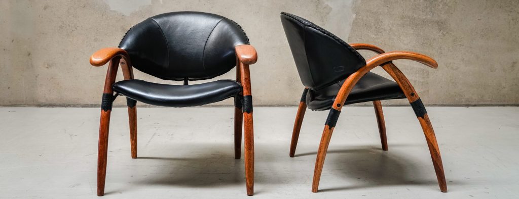
Want to redecorate but don’t know how to combine your existing furniture and décor? Don’t really know what your style is? Do you stick to neutrals because you don’t know how or where to bring in colour? Clients have these problems all the time. So, where on earth do you start?
This is the quandary of many homeowners who either decide to try their hand at a DIY project or enlist the services of a home improvement specialist. Either way, you’ll be dealing with colour. Speaking technically, ‘neutrals’ consist of only black, white and grey. The term neutral is incorrectly believed to encompass colours like beige, off-white, bone, tan, cream and taupe. By that definition, a neutral colour scheme is pretty rare.
With so many colours and neutrals to choose from, where do you start? You should choose colours you ‘like,’ but do the other family members like the same colours? And why do you like what you like anyway?
Two important words: colour psychology.
Colour psychology is the study of colours on an energetic level. It’s about the universal meanings of colour (although culture also plays a part) and the effects they have on every one of us.
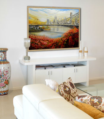 The starting point for your home project, whether it’s buying new furniture, commissioning a piece of art, painting your walls, or choosing a new splashback, should be a colour psychology reading with a trained Interior Specialist.
Using positive colours in your wall art is just one way to inject good energy, harmony and happiness into your home. Here are some other tips:
- The colour you choose to paint your internal walls will strongly affect you and your family because even white paint is never just white. It has colours added so be aware of the colours in the paint. Ask at the paint shop.
- Your bed should be a relaxing haven so this is a particularly important area where colour must be considered. Choose relaxing, not stimulating, hues for your sheets, pillow cases and quilts. The affects can be unbelievable.
- The dining room and kitchen are areas where nutrition and conversation are of the utmost importance. Highlight your good energy in these areas by using positive colours that support and enhance the mood you wish to create.
- Kids are particularly intuitive with colours so be sure to use colours that stimulate them in study and play areas and colours that relax and calm them in their bedrooms. Create good vibes and their behaviour will tend to follow.
- Home offices are an area where colour should be used to your advantage. You want to feel energetic, positive, abundant, alert and creative, so utilise colour to help you out and get business booming.
Make sure you visit the team from Tailored Artworks for more great tips on art and colour.